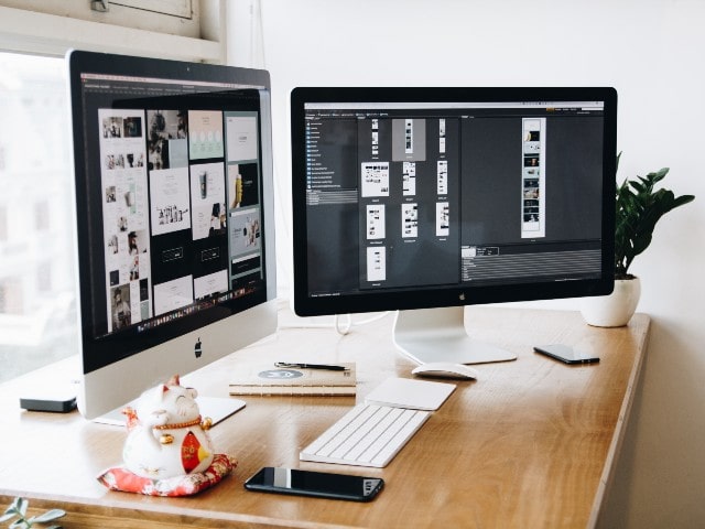
Responsive web design is a method of web design that allows websites to adapt to the screen size of the device they are being viewed on. This means that regardless of whether a website is being viewed on a phone, tablet, or computer, it will be easy to read and navigate. This is becoming increasingly important as more people use mobile devices to access the internet.
What Is Responsive Web Design?
A responsive web design[1] is a type of web design that allows a website to adapt to the screen size of the user’s device. This means that whether a user is on a desktop computer, a tablet, or a smartphone, they will be able to view the website without it looking cluttered or difficult to read.
One of the benefits of responsive web design is that it can help improve the user experience. When a website is easy to use and looks good on all devices, users are more likely to stay on the site and continue using it. This can lead to increased sales or leads for businesses that have an online presence.
Another benefit of responsive web design is that it can save time and money. Developing separate websites for each type of device can be time-consuming and expensive.
The History Of Responsive Web Design
The term “responsive web design” was first coined by Ethan Marcotte in a 2010 article for A List Apart. In it, he described how he used media queries and fluid grid layouts to build web pages that could adapt to any screen size.
Responsive web design has since become the standard for building websites that look good on any device. Most modern web designs are responsive, and many new website builders include responsive templates as an option.
The history of responsive web design began with Ethan Marcotte’s article in 2010. He laid out the principles of responsive design, which have since become the standard for building websites that look good on any device.
The Benefits Of Responsive Web Design
A responsive web design automatically adjusts to fit the screen size of the device it is being viewed on. This means that a website can be easily viewed on everything from a large desktop monitor to a small smartphone.
There are several benefits to using a responsive web design. First, it eliminates the need for separate mobile versions of websites. This can save time and money for businesses that don’t want to maintain two different site designs.
Second, responsive designs make it easy for users to view websites on different devices. They can simply resize their browser window or change the orientation of their device to get a custom viewing experience. This is especially beneficial for users who are constantly on the go and may not have access to a laptop or desktop computer.
Finally, responsive web design can help improve search engine optimization (SEO).
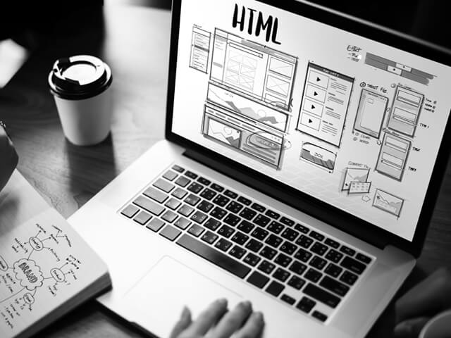
How To Create A Responsive Web Design
A responsive web design (RWD) is a type of web design that allows web pages to render well on a variety of devices, from mobile phones and tablets to desktop computers.
The key to creating a responsive web design is using a flexible grid system, which is built into most modern web development frameworks. This grid system automatically adjusts the width of website elements based on the screen size of the device it is being viewed on.
In addition to using a flexible grid system, responsive web design also typically uses media queries to further customize the look and feel of a website for different devices. Media queries allow different CSS rules to be applied based on the width of the device’s screen.
With more and more people accessing the internet from mobile devices, it’s important for websites to have a responsive design.
The Future Of Responsive Web Design
The responsive web design movement is still in its early stages, but there are already a number of trends that suggest where it might be headed. One is the increasing use of responsive design for email marketing. This makes sense since email is one of the few areas where users still primarily view content on desktop computers rather than mobile devices. By making emails responsive, companies can reach more customers and improve their click-through rates.
Another trend is the growing popularity of so-called “card layouts.” These are designs that consist of a series of individual cards, each of which can be resized and rearranged to fit different screen sizes. This type of layout is especially well-suited to e-commerce websites, where products can be displayed in a clean and concise way on any device.
Finally, we’re also seeing more experimentation with non-standard screen sizes and aspect ratios.
Conclusion
A responsive web design is a website that is designed to adjust to the screen size of the device on which it is being viewed. This ensures that the website can be viewed on any type of device, from a desktop computer to a mobile phone.
Responsive web design is important because it allows websites to be accessible to everyone, regardless of what type of device they are using. This makes the internet more accessible and user-friendly for everyone.
There are many different factors that go into creating a responsive web design, but the most important thing is to keep the user in mind. Creating a website that is easy to use and navigate on any device will ensure that everyone can enjoy the benefits of the internet.